반응형
React 컴포넌트 - CSS 버튼 생성기
오늘은 아래와 같은 버튼 생성기 인터페이스를 구현하는 React 컴포넌트를 만들어 드립니다. 이 컴포넌트는 사용자가 버튼의 스타일을 조절할 수 있고, 실시간으로 버튼 미리보기를 제공합니다.
CSS Button Generator UI
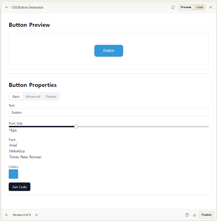
이 React 컴포넌트는 CSS 버튼 생성기의 기본적인 기능을 구현했습니다. 주요 특징은 다음과 같습니다:
- 버튼 미리보기: 사용자가 설정한 스타일이 실시간으로 적용된 버튼을 보여줍니다.
- 텍스트 입력: 버튼의 텍스트를 변경할 수 있습니다.
- 폰트 크기 조절: 슬라이더를 사용해 폰트 크기를 조절할 수 있습니다.
- 클래스 이름 설정: 생성된 CSS에서 사용할 클래스 이름을 지정할 수 있습니다.
- 폰트 선택: 드롭다운 메뉴에서 폰트를 선택할 수 있습니다.
- 박스 쉐도우와 텍스트 쉐도우: 토글 스위치로 켜고 끌 수 있습니다.
- CSS 코드 생성: "Get Code" 버튼을 클릭하면 현재 설정에 따른 CSS 코드를 생성합니다.
CSS Button Generator Code
import React, { useState } from 'react';
import { Slider } from '@/components/ui/slider';
import { Input } from '@/components/ui/input';
import { Label } from '@/components/ui/label';
import { Switch } from '@/components/ui/switch';
import { Button } from '@/components/ui/button';
import { Select, SelectTrigger, SelectValue, SelectContent, SelectItem } from '@/components/ui/select';
import { Popover, PopoverTrigger, PopoverContent } from '@/components/ui/popover';
import { Dialog, DialogTrigger, DialogContent, DialogHeader, DialogTitle, DialogDescription } from '@/components/ui/dialog';
import { Tabs, TabsList, TabsTrigger, TabsContent } from '@/components/ui/tabs';

const ColorPicker = ({ color, onChange }) => (
  <Popover>
    <PopoverTrigger asChild>
      <div className="w-10 h-10 rounded cursor-pointer" style={{ backgroundColor: color }} />
    </PopoverTrigger>
    <PopoverContent className="w-64">
      <input
        type="color"
        value={color}
        onChange={(e) => onChange(e.target.value)}
        className="w-full h-32"
      />
    </PopoverContent>
  </Popover>
);

const ButtonGenerator = () => {
  const [buttonStyle, setButtonStyle] = useState({
    text: 'Button',
    fontSize: 16,
    className: 'myButton',
    font: 'Arial',
    verticalSize: 12,
    horizontalSize: 37,
    borderRadius: 10,
    borderSize: 1,
    borderStyle: 'solid',
    boxShadow: true,
    textShadow: true,
    backgroundColor: '#3498db',
    textColor: '#ffffff',
    borderColor: '#2980b9',
    gradient: false,
    gradientStart: '#3498db',
    gradientEnd: '#2980b9',
    showBorder: true,
  });

  const [showCSSModal, setShowCSSModal] = useState(false);

  const updateStyle = (key, value) => {
    setButtonStyle(prev => ({ ...prev, [key]: value }));
  };

  const generateCSS = () => {
    let css = `.${buttonStyle.className} {\n`;
    css += `  font-size: ${buttonStyle.fontSize}px;\n`;
    css += `  font-family: ${buttonStyle.font};\n`;
    css += `  padding: ${buttonStyle.verticalSize}px ${buttonStyle.horizontalSize}px;\n`;
    css += `  border-radius: ${buttonStyle.borderRadius}px;\n`;
    if (buttonStyle.showBorder) {
      css += `  border: ${buttonStyle.borderSize}px ${buttonStyle.borderStyle} ${buttonStyle.borderColor};\n`;
    } else {
      css += `  border: none;\n`;
    }
    css += `  color: ${buttonStyle.textColor};\n`;

    if (buttonStyle.gradient) {
      css += `  background: linear-gradient(to bottom, ${buttonStyle.gradientStart}, ${buttonStyle.gradientEnd});\n`;
    } else {
      css += `  background-color: ${buttonStyle.backgroundColor};\n`;
    }

    if (buttonStyle.boxShadow) {
      css += `  box-shadow: 0 4px 6px rgba(0, 0, 0, 0.1);\n`;
    }

    if (buttonStyle.textShadow) {
      css += `  text-shadow: 1px 1px 2px rgba(0, 0, 0, 0.2);\n`;
    }

    css += `}\n`;
    return css;
  };

  const presets = {
    default: {
      backgroundColor: '#3498db',
      textColor: '#ffffff',
      borderColor: '#2980b9',
    },
    success: {
      backgroundColor: '#2ecc71',
      textColor: '#ffffff',
      borderColor: '#27ae60',
    },
    warning: {
      backgroundColor: '#f1c40f',
      textColor: '#ffffff',
      borderColor: '#f39c12',
    },
    danger: {
      backgroundColor: '#e74c3c',
      textColor: '#ffffff',
      borderColor: '#c0392b',
    },
  };

  const applyPreset = (presetName) => {
    setButtonStyle(prev => ({ ...prev, ...presets[presetName] }));
  };

  return (
    <div className="flex flex-col md:flex-row gap-4 p-4">
      <div className="w-full md:w-1/2 bg-white p-4 rounded-lg shadow">
        <h2 className="text-2xl font-bold mb-4">Button Preview</h2>
        <div className="border p-4 flex justify-center items-center h-40">
          <button
            className={`px-4 py-2 rounded`}
            style={{
              fontSize: `${buttonStyle.fontSize}px`,
              fontFamily: buttonStyle.font,
              padding: `${buttonStyle.verticalSize}px ${buttonStyle.horizontalSize}px`,
              borderRadius: `${buttonStyle.borderRadius}px`,
              border: buttonStyle.showBorder ? `${buttonStyle.borderSize}px ${buttonStyle.borderStyle} ${buttonStyle.borderColor}` : 'none',
              color: buttonStyle.textColor,
              backgroundColor: buttonStyle.gradient ? 'transparent' : buttonStyle.backgroundColor,
              background: buttonStyle.gradient
                ? `linear-gradient(to bottom, ${buttonStyle.gradientStart}, ${buttonStyle.gradientEnd})`
                : buttonStyle.backgroundColor,
              boxShadow: buttonStyle.boxShadow ? '0 4px 6px rgba(0,0,0,0.1)' : 'none',
              textShadow: buttonStyle.textShadow ? '1px 1px 2px rgba(0,0,0,0.2)' : 'none',
            }}
          >
            {buttonStyle.text}
          </button>
        </div>
      </div>

      <div className="w-full md:w-1/2 bg-white p-4 rounded-lg shadow">
        <h2 className="text-2xl font-bold mb-4">Button Properties</h2>

        <Tabs defaultValue="basic">
          <TabsList>
            <TabsTrigger value="basic">Basic</TabsTrigger>
            <TabsTrigger value="advanced">Advanced</TabsTrigger>
            <TabsTrigger value="presets">Presets</TabsTrigger>
          </TabsList>

          <TabsContent value="basic" className="space-y-4">
            <div>
              <Label htmlFor="buttonText">Text</Label>
              <Input
                id="buttonText"
                value={buttonStyle.text}
                onChange={(e) => updateStyle('text', e.target.value)}
              />
            </div>

            <div>
              <Label htmlFor="fontSize">Font Size</Label>
              <Slider
                id="fontSize"
                min={8}
                max={32}
                step={1}
                value={[buttonStyle.fontSize]}
                onValueChange={(value) => updateStyle('fontSize', value[0])}
              />
              <span>{buttonStyle.fontSize}px</span>
            </div>

            <div>
              <Label htmlFor="font">Font</Label>
              <Select
                value={buttonStyle.font}
                onValueChange={(value) => updateStyle('font', value)}
              >
                <SelectTrigger id="font">
                  <SelectValue placeholder="Select font" />
                </SelectTrigger>
                <SelectContent>
                  <SelectItem value="Arial">Arial</SelectItem>
                  <SelectItem value="Helvetica">Helvetica</SelectItem>
                  <SelectItem value="Times New Roman">Times New Roman</SelectItem>
                </SelectContent>
              </Select>
            </div>

            <div>
              <Label>Colors</Label>
              <div className="flex space-x-2">
                <ColorPicker
                  color={buttonStyle.backgroundColor}
                  onChange={(color) => updateStyle('backgroundColor', color)}
                />
                <ColorPicker
                  color={buttonStyle.textColor}
                  onChange={(color) => updateStyle('textColor', color)}
                />
              </div>
            </div>

            <div className="flex items-center space-x-2">
              <Switch
                id="showBorder"
                checked={buttonStyle.showBorder}
                onCheckedChange={(checked) => updateStyle('showBorder', checked)}
              />
              <Label htmlFor="showBorder">Show Border</Label>
            </div>
          </TabsContent>

          <TabsContent value="advanced" className="space-y-4">
            <div>
              <Label htmlFor="borderRadius">Border Radius</Label>
              <Slider
                id="borderRadius"
                min={0}
                max={20}
                step={1}
                value={[buttonStyle.borderRadius]}
                onValueChange={(value) => updateStyle('borderRadius', value[0])}
              />
              <span>{buttonStyle.borderRadius}px</span>
            </div>

            {buttonStyle.showBorder && (
              <>
                <div>
                  <Label htmlFor="borderSize">Border Size</Label>
                  <Slider
                    id="borderSize"
                    min={0}
                    max={5}
                    step={1}
                    value={[buttonStyle.borderSize]}
                    onValueChange={(value) => updateStyle('borderSize', value[0])}
                  />
                  <span>{buttonStyle.borderSize}px</span>
                </div>

                <div>
                  <Label htmlFor="borderStyle">Border Style</Label>
                  <Select
                    value={buttonStyle.borderStyle}
                    onValueChange={(value) => updateStyle('borderStyle', value)}
                  >
                    <SelectTrigger id="borderStyle">
                      <SelectValue placeholder="Select border style" />
                    </SelectTrigger>
                    <SelectContent>
                      <SelectItem value="solid">Solid</SelectItem>
                      <SelectItem value="dashed">Dashed</SelectItem>
                      <SelectItem value="dotted">Dotted</SelectItem>
                    </SelectContent>
                  </Select>
                </div>

                <div>
                  <Label>Border Color</Label>
                  <ColorPicker
                    color={buttonStyle.borderColor}
                    onChange={(color) => updateStyle('borderColor', color)}
                  />
                </div>
              </>
            )}

            <div className="flex items-center space-x-2">
              <Switch
                id="gradient"
                checked={buttonStyle.gradient}
                onCheckedChange={(checked) => updateStyle('gradient', checked)}
              />
              <Label htmlFor="gradient">Use Gradient</Label>
            </div>

            {buttonStyle.gradient && (
              <div className="flex space-x-2">
                <ColorPicker
                  color={buttonStyle.gradientStart}
                  onChange={(color) => updateStyle('gradientStart', color)}
                />
                <ColorPicker
                  color={buttonStyle.gradientEnd}
                  onChange={(color) => updateStyle('gradientEnd', color)}
                />
              </div>
            )}

            <div className="flex items-center space-x-2">
              <Switch
                id="boxShadow"
                checked={buttonStyle.boxShadow}
                onCheckedChange={(checked) => updateStyle('boxShadow', checked)}
              />
              <Label htmlFor="boxShadow">Box Shadow</Label>
            </div>

            <div className="flex items-center space-x-2">
              <Switch
                id="textShadow"
                checked={buttonStyle.textShadow}
                onCheckedChange={(checked) => updateStyle('textShadow', checked)}
              />
              <Label htmlFor="textShadow">Text Shadow</Label>
            </div>
          </TabsContent>

          <TabsContent value="presets" className="space-y-4">
            <div className="grid grid-cols-2 gap-2">
              {Object.entries(presets).map(([name, preset]) => (
                <Button
                  key={name}
                  onClick={() => applyPreset(name)}
                  style={{
                    backgroundColor: preset.backgroundColor,
                    color: preset.textColor,
                    border: `1px solid ${preset.borderColor}`,
                  }}
                >
                  {name.charAt(0).toUpperCase() + name.slice(1)}
                </Button>
              ))}
            </div>
          </TabsContent>
        </Tabs>

        <div className="mt-4">
          <Dialog open={showCSSModal} onOpenChange={setShowCSSModal}>
            <DialogTrigger asChild>
              <Button onClick={() => setShowCSSModal(true)}>
                Get Code
              </Button>
            </DialogTrigger>
            <DialogContent>
              <DialogHeader>
                <DialogTitle>Generated CSS</DialogTitle>
                <DialogDescription>
                  Copy and paste this CSS into your stylesheet:
                </DialogDescription>
              </DialogHeader>
              <pre className="bg-gray-100 p-4 rounded overflow-auto">
                {generateCSS()}
              </pre>
            </DialogContent>
          </Dialog>
        </div>
      </div>
    </div>
  );
};

export default ButtonGenerator;
- 색상 선택기: 배경색, 텍스트 색상, 테두리 색상을 선택할 수 있는 색상 선택기를 추가했습니다.
- 테두리 스타일: 테두리 두께, 스타일(실선, 점선, 파선), 색상을 설정할 수 있습니다.
- 그라디언트 옵션: 버튼 배경에 그라디언트를 적용할 수 있는 옵션을 추가했습니다. 시작 색상과 끝 색상을 선택할 수 있습니다.
- CSS 코드 모달: "Get Code" 버튼을 클릭하면 생성된 CSS 코드를 모달 창에서 볼 수 있습니다.
- 프리셋 스타일: 미리 정의된 스타일(기본, 성공, 경고, 위험)을 선택할 수 있는 프리셋 탭을 추가했습니다.
- 탭 인터페이스: 기본 설정, 고급 설정, 프리셋을 탭으로 구분하여 UI를 개선했습니다.
- 실시간 미리보기: 모든 설정 변경사항이 실시간으로 버튼 미리보기에 반영됩니다.
이 개선된 이 버전을 사용하면 사용자들이 더욱 다양하고 세밀한 스타일의 버튼을 쉽게 만들 수 있습니다. 또한 사용자가 직관적으로 버튼 스타일을 조정하고, 그에 맞는 CSS 코드를 쉽게 얻을 수 있습니다. 티스토리나 다른 블로그 플랫폼에서 사용할 수 있는 맞춤형 버튼을 만드는 데 유용할 것입니다. 맞춤버튼제작기...
반응형